

MEU ECO - Cosméticos Naturais | Identidade Visual e Rótulos - 2021


A Meu Eco é uma marca de cosméticos naturais e artesanais de baixo impacto ambiental, que oferece produtos como shampoos e condicionadores sólidos, sabonetes e acessórios ecológicos. Ela busca ser referência no segmento como uma empresa que tem responsabilidade ambiental, humanização em seus processos e que promove a beleza e o bem-estar de forma sustentável.
Sua identidade visual foi pensada para ser funcional e atraente, incentivando os clientes de diferentes classes econômicas a explorarem os benefícios dos cosméticos naturais, além de incentivá-los a adotar um estilo de vida mais consciente.
[EN] Meu Eco is a brand of natural and artisanal cosmetics with a low environmental impact, which offers products such as solid shampoos and conditioners, soaps and ecological accessories. It seeks to be a reference in the segment as a company that has environmental responsibility, humanization in its processes and that promotes beauty and well-being in a sustainable way. Its visual identity was designed to be functional and attractive, encouraging customers from different economic classes to explore the benefits of natural cosmetics, as well as encouraging them to adopt a more conscious lifestyle.

A Brunna, fundadora da marca é licenciada em Química e era importante para ela que houvesse uma ligação entre sua área de formação e a identidade da Meu Eco. Por isso, ela já utilizava em seu logotipo antigo a representação do balão de ensaio, um tipo de vidraria muito utilizado no meio laboratorial para realização de procedimentos e pesquisas científicas.
Esse desejo foi mantido na nova identidade visual, dessa vez de forma mais moderna, profissional e fluida. A inclusão da folha, símbolo máximo do ciclo da vida, trouxe um frescor e leveza. A escolha de uma tipografia amigável e carismática permitiu transmitir bem a personalidade humana da marca.
[EN] Brunna, founder of the brand, has a degree in Chemistry and it was important for her that there was a connection between her area of training and the identity of Meu Eco. Therefore, she already used in her old logo the representation of the test balloon, a type glassware widely used in laboratories to carry out procedures and scientific research. This desire was maintained in the new visual identity, this time in a more modern, professional and fluid way. The inclusion of the leaf, the ultimate symbol of the cycle of life, brought freshness and lightness. The choice of a friendly and charismatic typography allowed the brand's human personality to be conveyed well.


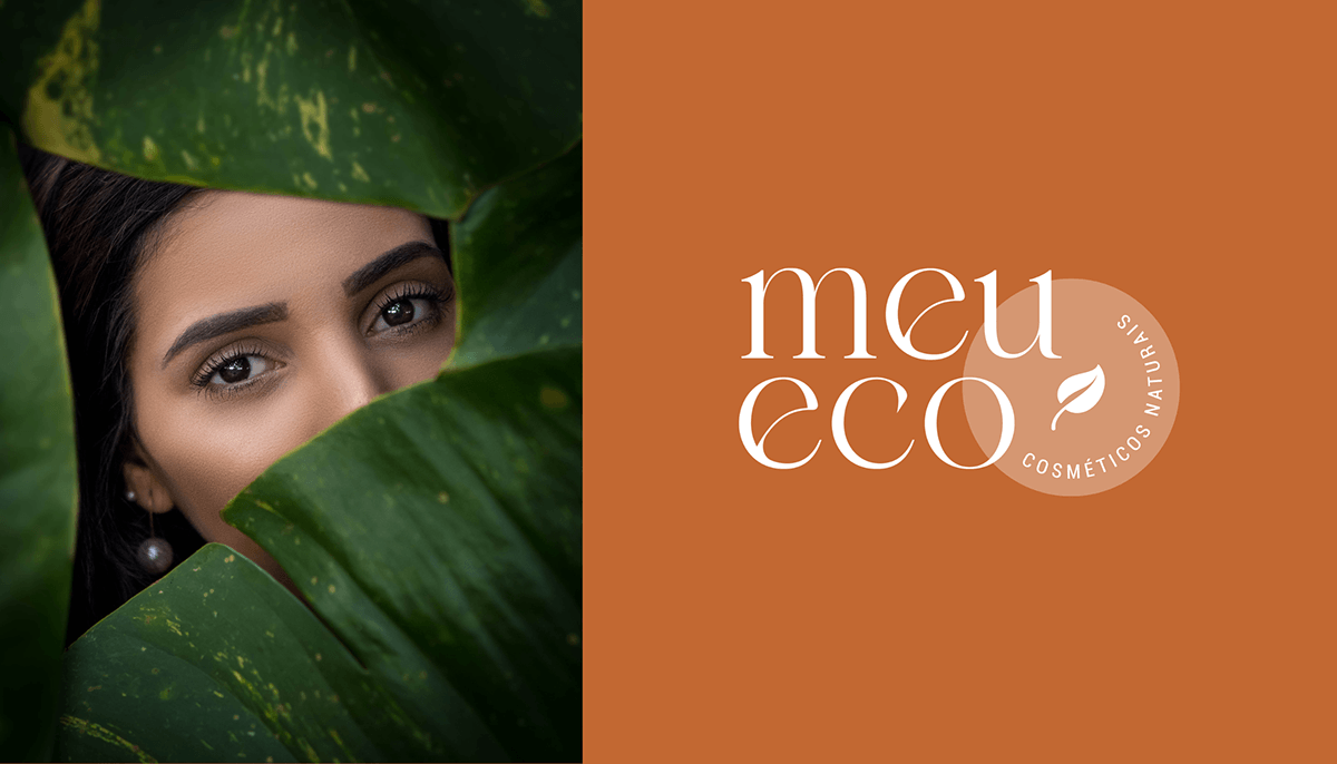
As cores da Meu Eco fazem referência aos elementos da natureza e reforçam a vitalidade e energia. O verde evoca a natureza, simbolizando crescimento, renovação e equilíbrio. O laranja vibrante e ensolarado, reforça o entusiasmo e alegria de despertar os sentidos. A combinação convida a nos reconectarmos com nossa beleza autêntica e ao mundo nosso redor.
[EN] Meu Eco's colors reference the elements of nature and reinforce vitality and energy. Green evokes nature, symbolizing growth, renewal and balance. Vibrant and sunny orange reinforces the enthusiasm and joy of awakening the senses. The combination invites us to reconnect with our authentic beauty and the world around us.

O projeto ainda incluiu a criação dos rótulos para os produtos que, pensado para ser de baixíssimo custo e gerar o mínimo de resíduos possíveis, contou com impressão em papel reciclado e kraft e embalagem eco-friendly com celofane vegetal biodegradável e retornáveis. Os rótulos apresentam informações claras sobre os ingredientes naturais utilizados, seus benefícios, fabricação, validade e o selo de compromisso da empresa com a sustentabilidade. Tudo buscando manter a coerência entre a ideologia da Meu Eco e sua aplicação no mundo real.
[EN] The project also included the creation of labels for the products, which, designed to be extremely low cost and generate as little waste as possible, were printed on recycled and kraft paper and eco-friendly packaging with biodegradable vegetable cellophane. The labels present clear information about the natural ingredients used, their benefits, manufacturing, validity and the company's seal of commitment to sustainability. All seeking to maintain coherence between Meu Eco's ideology and its application in the real world.


Obrigada por ver esse projeto!
Adoraria saber o que você achou. Deixe um comentário!
Thank you for viewing this project! would love to know what you think. Leave a comment!
Siga-me / Follow me : Instagram
E-mail: chrisfreitas.contato@gmail.com
Direitos de fotografias reservados a Meu Eco.


